1. 2.


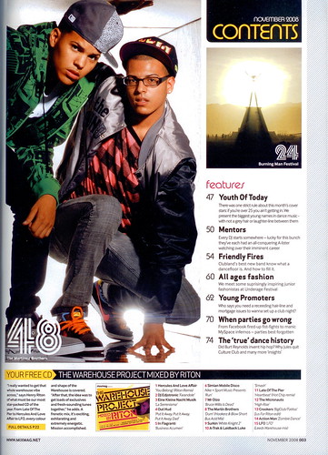
For the first contents page, it's a simple layout but looks professional because it has a big picture of the two teenage boys on most of the page. The column on the right hand-side is the area which tell its audiences what topic is on which page. The bottom bit says about their project which tell the audiences what their project is all about and how the project getting on. I think the first contents page is quite good as it doesn't have much photos on it which will make it looks untidy. It also have another photo which give us some ideas where and what would P.24 be about. For this magazine it provides free CD for its audiences who buy the magazine, this also help them to be able to sell their magazine more and in a bit higher price.We could tell the style of each person by looking at how they dress.The costumes from the picture of two teenage boys tell its audiences about the style of the music that the teens sing or have interested in. For the first magazine it has only one section, features is the only section of this magazine.
For the second contents page, it's much more images in it. It also identify the kind of its magazine by saying "DRUMMER", they also put a big picture of a person playing drum right in the middle of the page and the other two pictures of drum in the contents page so the reader can know straightaway that the magazine is for drummer and for people who have interested in playing drum. In term of colour the back ground colour is white and white colour is contrast with most of the colours. The colour of the text box is in orange and text in white colour which are also contrast so it can be easily see and read by its audiences. The number of each topic are in different colour so it can be easily see and spot. For this contents page there are two sections, the first section is features and the second section is Regulars.
So what do they have in common?
- They have images in the contents page which identify the type of each magazines.
- They show the number of each topic clearly as the numbers are quite big and not too close to the text behind them.
So what are the difference?
- For the first magazine, it has free CD inside the magazine which the second magazine doesn't have.
- For the contents page of the second magazine, it contains lots of images while the first one has only one big image and the little one on the side.
- The second contents page seems to be more colourful while the first one is mostly in black and white. However the first one is still look really good as it makes the models look stand out by putting less colour on the page so most colours will come from the costumes of the models.
No comments:
Post a Comment